Wendy’s once again redesigned their logo. The previous mark was a train wreck destroyed by a tornado. The large, famously known typeface, the odd swirly things that represent nothing — possibly curly fries? I don’t know. I’ve only been there a couple times. Then there’s the weird yellow plaque thing that resembles the title holder on one of those Big Mouth Billy Bass fish suburban wannabe rednecks display on their garage walls. And what’s with the placement of it? It’s just a weird-shaped background inside of another background that’s double outlined.
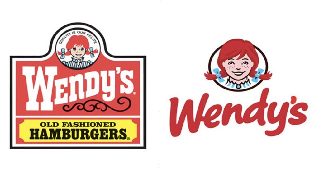
Now let’s move to the top: the girl. What’s with the uneven outline of the circle? Why is her hair popping up? Is their slogan, “Quality is our recipe,” so unimportant that it needs to be that small? If so, why are we even including it, let alone putting it above everything else? The proportions are strange. The colors are strange. Blue, red, yellow, white and black. Okay, I could go on, but we’ve covered the basics.
Now on to the new logo. As usual, first opinions don’t mean much because people are so familiar with the old logo, and people like what they’re familiar with. People typically don’t like change because it temporarily disconnects them from that company. It happens with everything. People who preferred Facebook’s old site design over its new design would probably, after enough time, hate going back to the old one.
Anyway, the new Wendy’s logo. Again, I’m not a consumer. I’ve only been there twice in my life. I haven’t researched the company or the history of its branding. I chose not to because I didn’t want to ruin my opinion as a general consumer who likely wouldn’t know any of that information.
It looks friendly. The girl isn’t too illustrated. It’s clean, it’s friendly, it’s refreshing. They dropped the trademark symbol, which also helps make it feel friendlier. They had the confidence to change their historic connection, and a few other things a typographic dork might not like, but in the case of a logo, I think they pulled it off.
It should be unique, and this font — like many others that try this approach — looks like somebody actually took a Sharpie and wrote the name. That’s difficult to pull off, and many, many, many people fail at perfecting it. I think it works because they didn’t try to follow typographic rules. People don’t write while thinking about typography. The designer drew what they wanted to draw, not what they thought they should draw.
The girl’s hair respects realism much more, and I love that she’s now breaking out of the circle. Smiling children aren’t portrayed as calm and relaxed and almost not noticeable. The new Wendy is more childlike. She’s breaking out of the circle. Her freakish passion for fast food is breaking out of the circle. She’s stylized. She has a personality that didn’t exist earlier this week. Her clothing is updated to be more relatable, but still contains that history.
The overall logo is unique enough to get recognition. It’s unlike any other fast-food chain’s identity.
Simply put, it’s respectable.