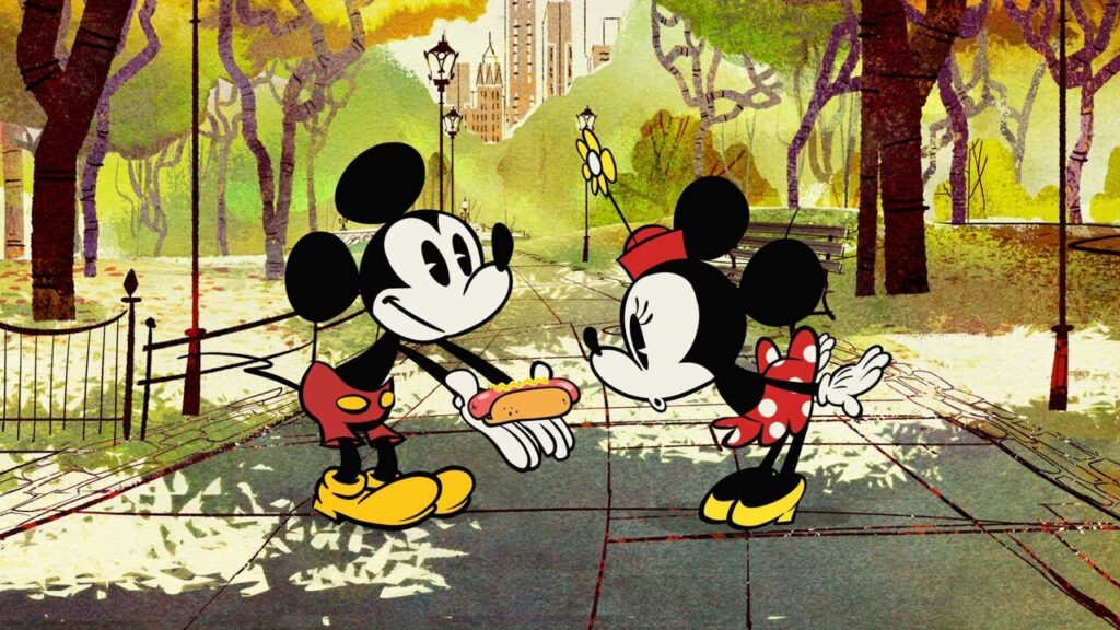
disney has never really been on my radar for animation. their animation doesn’t compare to pixar or even some independent filmmakers for me, so i was surprised by how much i liked their new mickey mouse short, “croissant de triomphe.”
more than anything, i love the way this thing looks.
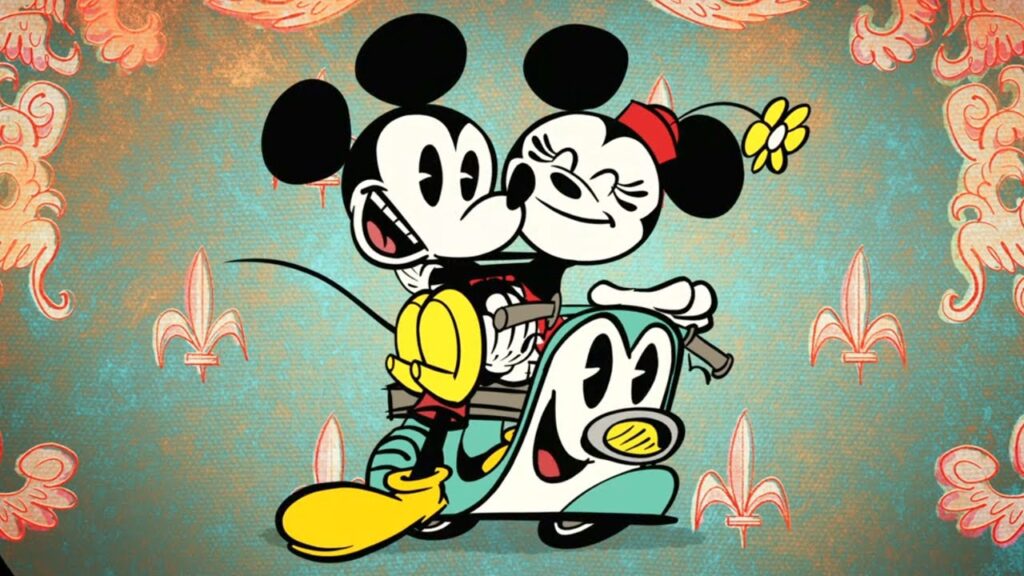
the new version of mickey was designed by paul rudish, who worked on cartoon network shows like the powerpuff girls and dexter’s laboratory. he’s now directing and executive producing these new mickey shorts, which take mickey and the rest of the characters to places like new york, paris, beijing, venice and santa monica.
and god, i love this artwork.
it’s just so beautiful. fun, expressive, colorful, weird and completely its own thing. i love the textures, the backgrounds, the imperfect lines and how everything looks like it was actually drawn rather than polished until every bit of personality disappeared.
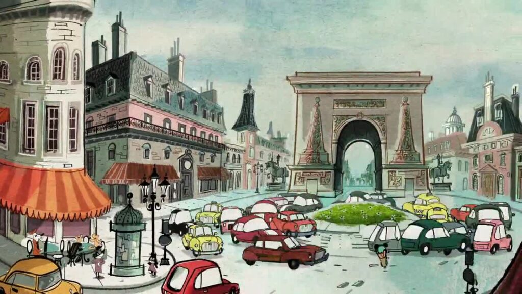
the locations are especially fucking cool. paris looks like paris, new york looks like new york, but neither feels like somebody simply drew mickey on top of a realistic background. the whole world gets pulled into the same strange illustrated style.
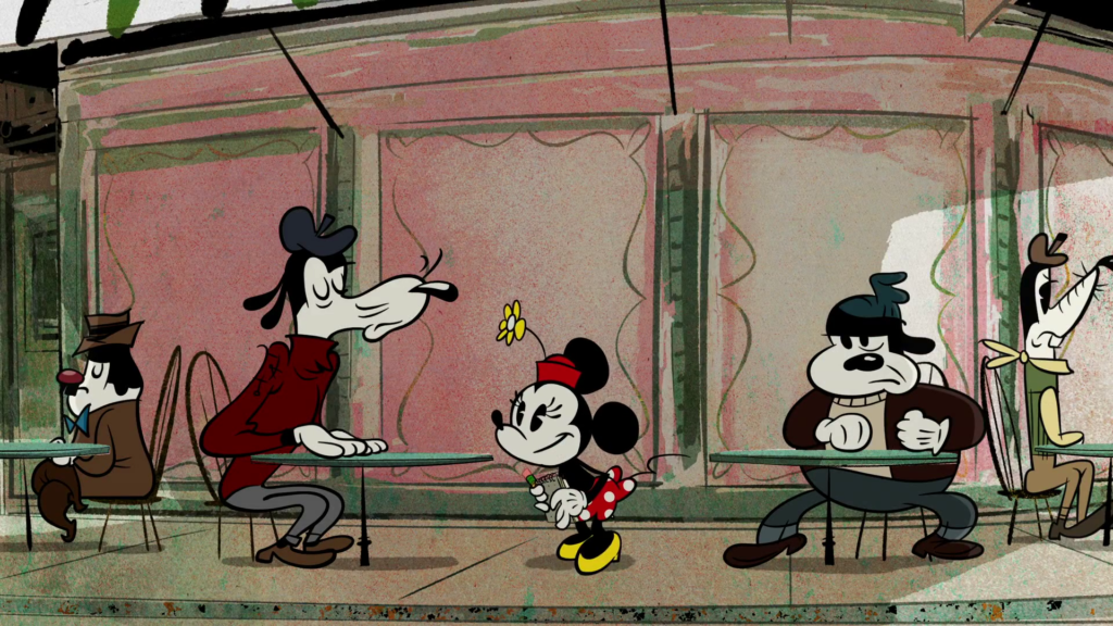
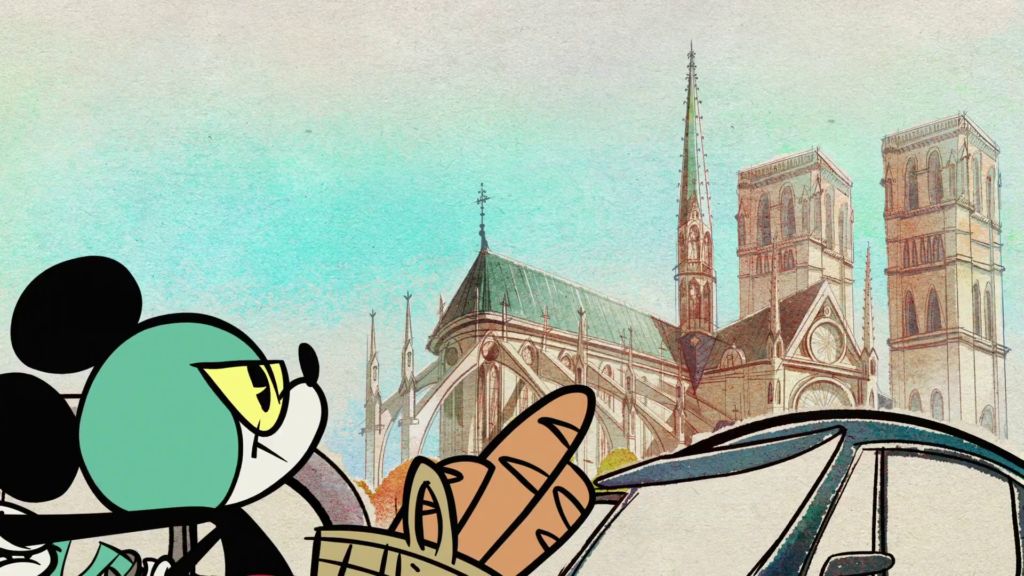
and mickey himself is so much better this way. he’s loose, ridiculous and expressive. the older style is obviously still there, but it feels like somebody was actually willing to screw around with it instead of treating mickey mouse like some sacred corporate artifact that nobody is allowed to touch.
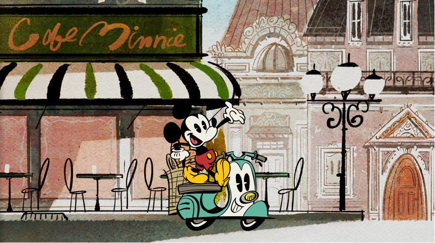
i can safely say it’s the greatest the little mouse has looked all i want, but that doesn’t matter if passionate mickey fans disagree.
personally, though, i think they nailed it.