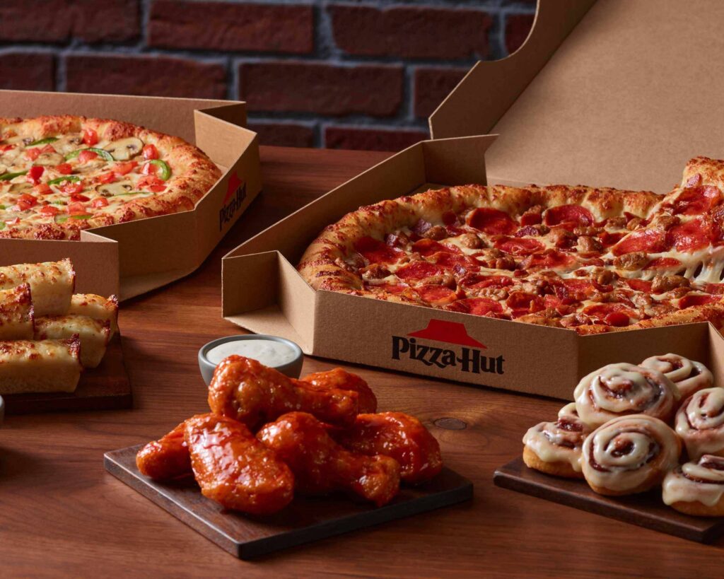
Pizza Hut is going back to its old red roof branding. The company says it’s spent years being too “meek and shy” with its branding and wants to be a little braver and bolder.
Good.

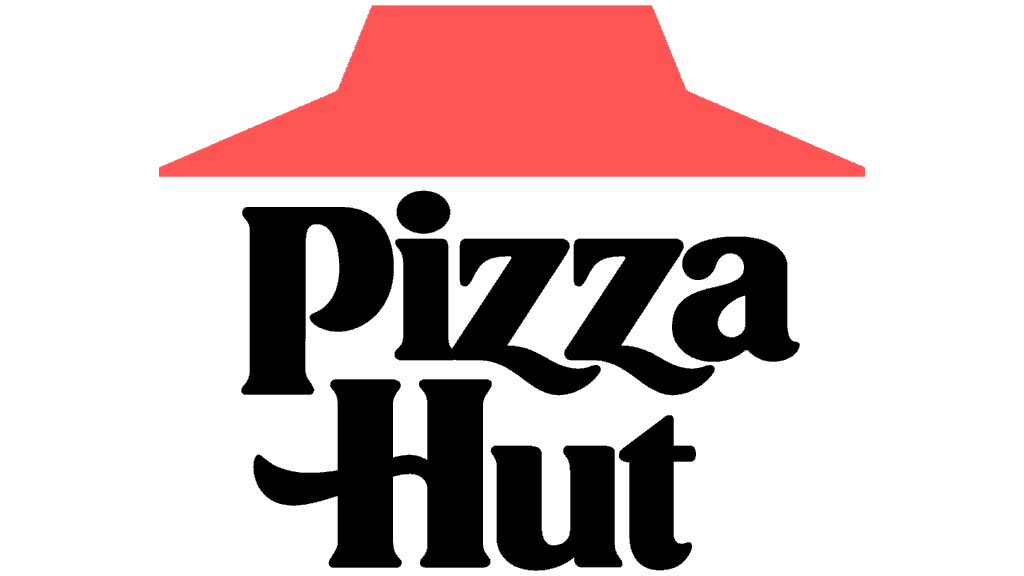
The newer branding never had much personality. The old logo actually feels like Pizza Hut. The red roof, the chunky lettering, the whole slightly retro look — it’s recognizable in a way the newer stuff wasn’t.
I always like when a company realizes it already had something good instead of redesigning itself into something more generic.
Side note: one of Pizza Hut’s biggest competitors owns one of my favorite logos.