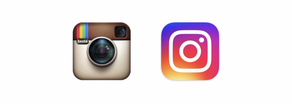
while downloading a new app on my phone yesterday, i saw something in the updates section of the app store. it was something more than just another silly “we claim to improve the app weekly, but refuse to tell you what we’ve changed” description.
icon
what i saw in the app store was a brand new instagram icon waiting. i forgot about the app i was planning to download and instantly tapped update.
the old, outdated icon is finally off my homescreen; replacing it is a simple white icon inside of a colorful background. within an hour or two, i went from not knowing what to think of it to absolutely loving it.
alongside the flat icons of other applications, the new icon stands out from everything else on my phone. and i’m not just saying that because it sits right next to the ugly tweetbot icon. come on, tweetbot. you can do better.
interface
what i did not expect after seeing the bright, colorful icon was a flat gray interface. i instantly loved the simplistic redesign.
the functionality of the new design is a complete success. photographs are beautifully displayed front and center. the interface mostly gets out of the way and lets the photos be the colorful part of instagram.
even editing photos against a simple white background feels better. it’s one of those things i didn’t realize i wanted until instagram gave it to me.
haters
some will say the icon is ugly and old school because it contains a gradient. i, on the other hand, understand that anything wrong can be done right. besides, if we want to talk old school, let’s take another look at their previous chunky logo and unflattering blue.
there seems to be a pattern with redesigned identities: designers love them, the public claims they can’t stand them, and then eventually everyone gets used to them.
then what happens? we’ve all seen it before. the next redesign comes along and suddenly people are defending the design they originally hated.
people like what they’re familiar with. change something they look at every single day and, of course, it’s going to feel wrong for a while.
innovation
i think part of the problem is that we, as consumers, don’t always know what we want until we have it.
we get comfortable. once something becomes familiar, changing it can feel unnecessary even when the new version might actually be better. that doesn’t mean every redesign is good, and it definitely doesn’t mean companies are always right. sometimes a redesign really is just shit.
but if everything stayed inside that safe little comfort zone, nothing would ever really change. somebody eventually has to try something different and see if it works.
instagram did that here. they replaced one of the most recognizable app icons on my phone with something completely different, stripped most of the color out of the actual interface, and basically bet that people would get used to it.
it took me about two hours.
i’d say it worked.